VAL. All projects Todos los proyectos
VSPT Wine Group — Brand identity
VSPT Wine Group · One of Chile's leading wine producers

Supporting the refresh of a global wine brand.

Apoyando el refresh de una marca global del vino.

Role / Services
Rol / Servicios
Brand Designer (Support) Brand Designer (Soporte) Brand Implementation Implementación Content & Photography Contenido y fotografía
Studio · Year
Estudio · Año
BlancaEstudio · 2020–2021
Project Overview
Resumen del proyecto

A brand refresh at global scale.

Un brand refresh a escala global.

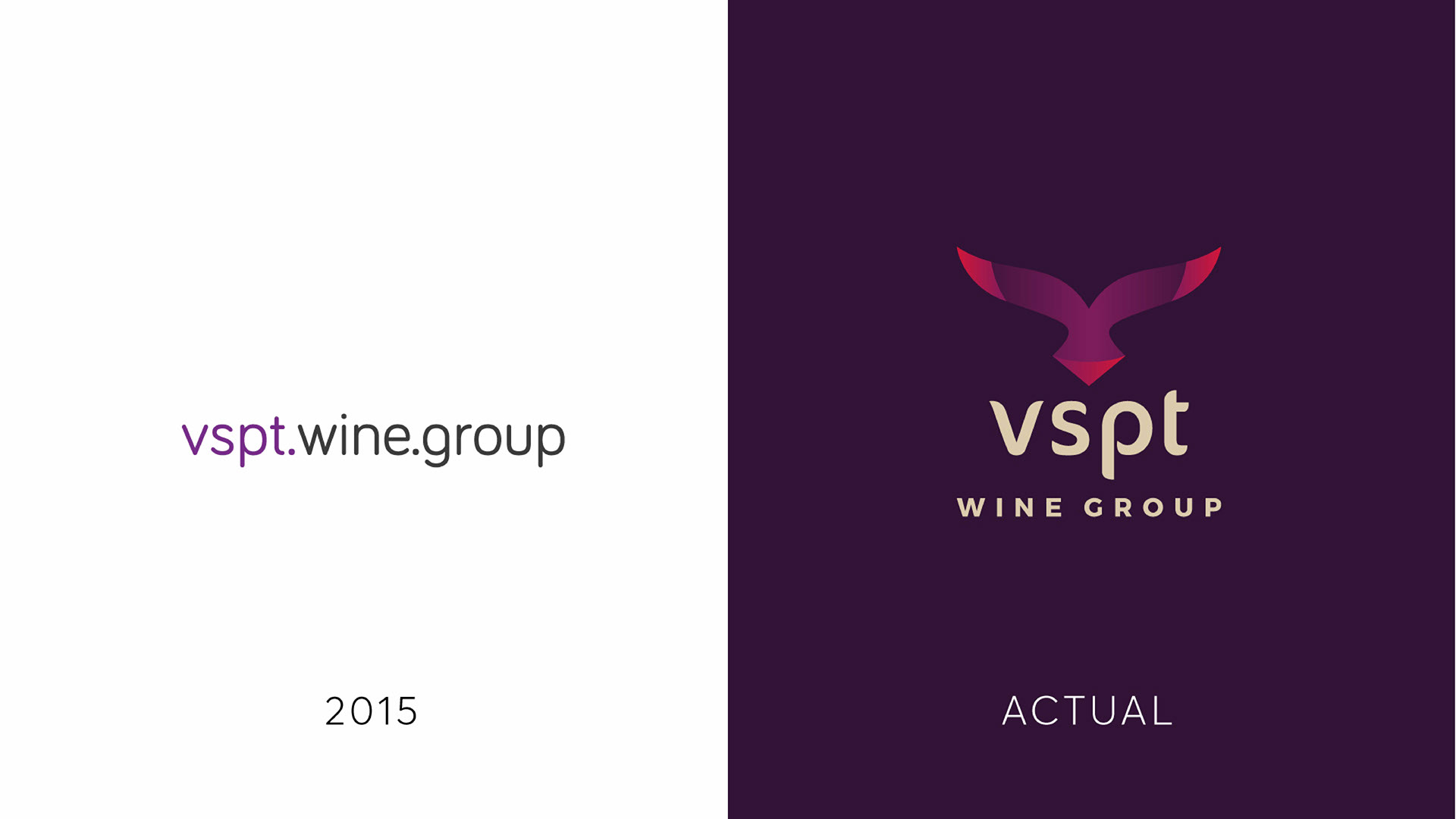
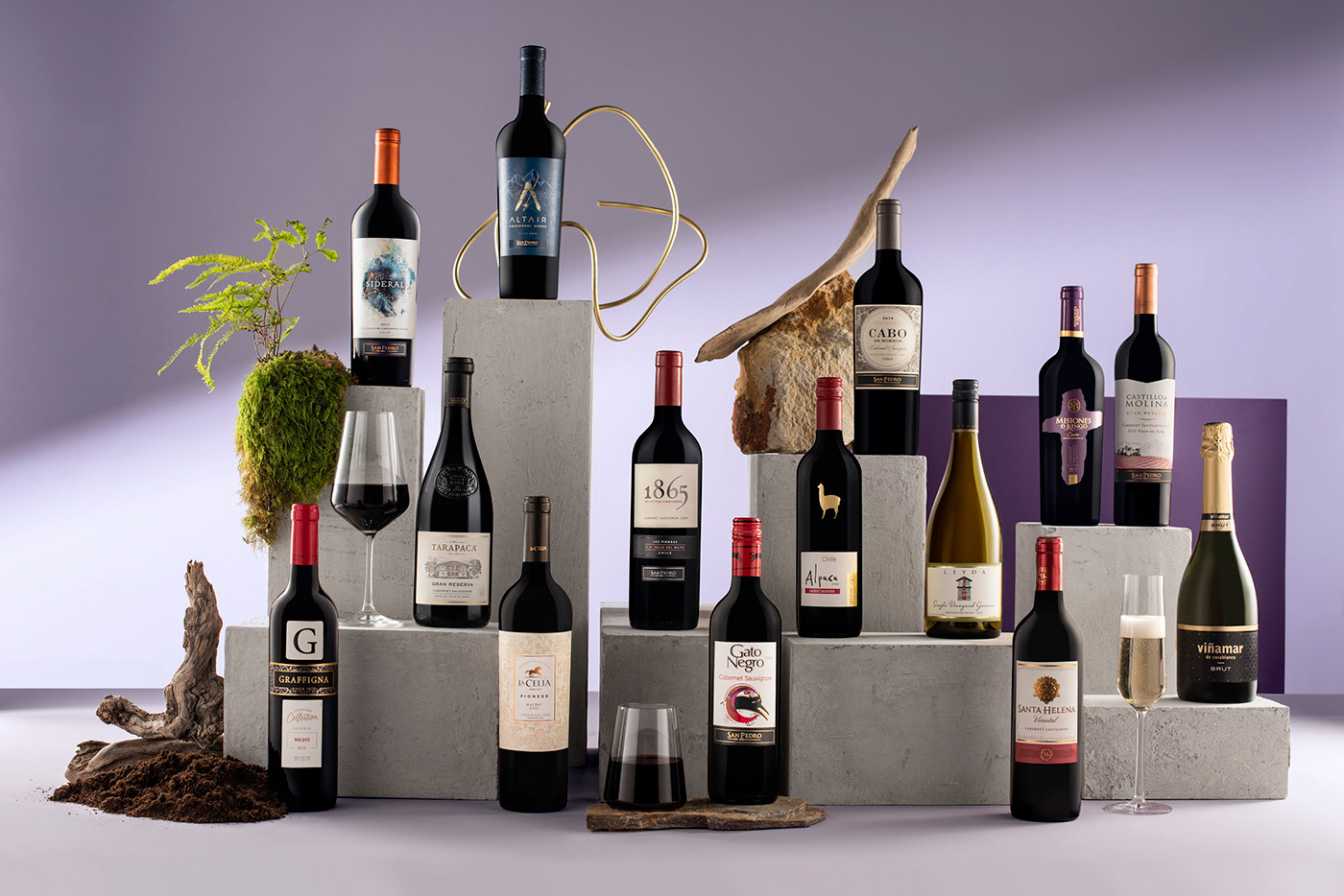
VSPT Wine Group is one of Chile's leading wine producers — home to iconic labels like Santa Helena, 1865, Tarapacá, Altair, Sideral, Cabo de Hornos, Leyda, Gato Negro, Alpaca, Graffigna and La Celia, among others.

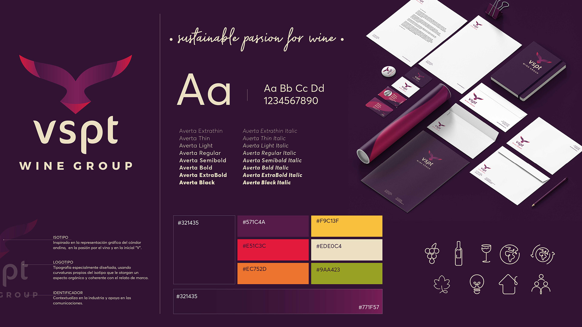
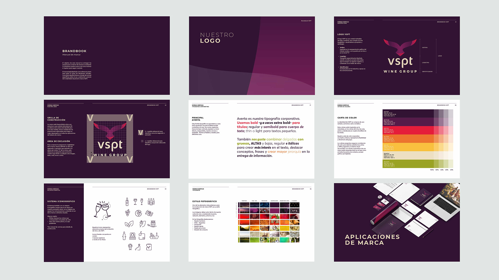
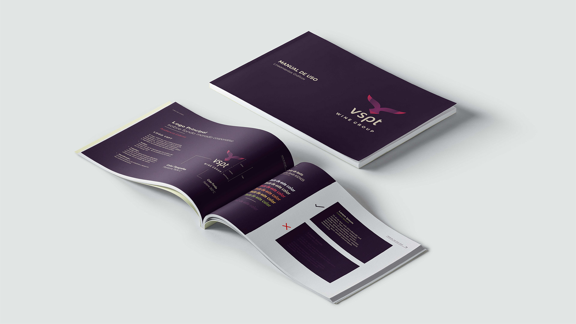
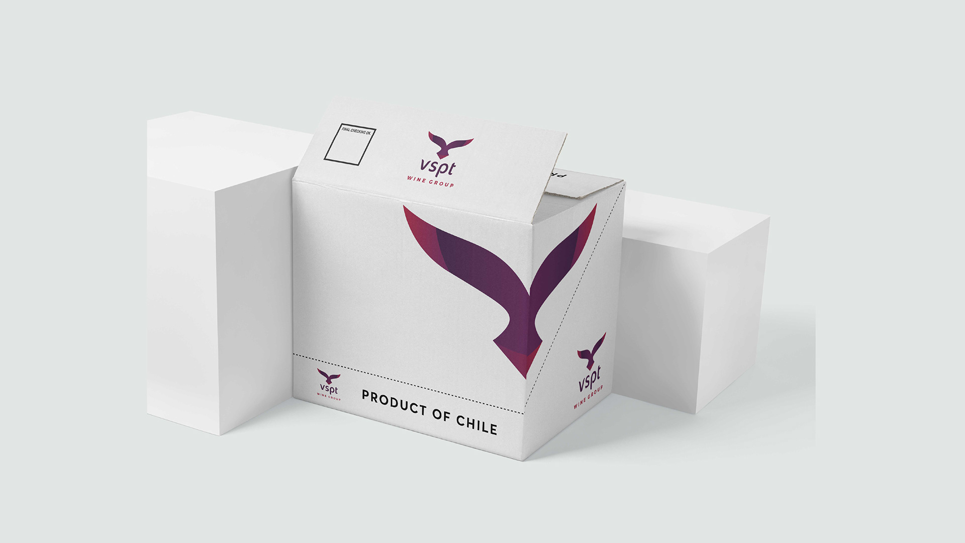
I supported the implementation of the new brand identity across every touchpoint — applying the system with consistency, participating in content creation and brand photography sessions, and helping translate the strategic vision into tangible, emotional pieces.

VSPT Wine Group es una de las viñas líderes de Chile — casa de etiquetas icónicas como Santa Helena, 1865, Tarapacá, Altair, Sideral, Cabo de Hornos, Leyda, Gato Negro, Alpaca, Graffigna y La Celia, entre otras.

Apoyé la implementación de la nueva identidad de marca en cada punto de contacto — aplicando el sistema con consistencia, participando en sesiones de creación de contenido y fotografía, y ayudando a traducir la visión estratégica en piezas tangibles y emotivas.

Top 20
Wine producers worldwide
Productores de vino a nivel mundial
18M+
Cases sold annually
Cajas vendidas anualmente
Top 10
Producers in the Argentine domestic market
Productores en el mercado doméstico argentino
#1
In premium wine and sparkling sales in Chile
En ventas de vino premium y espumantes en Chile
My Role
Mi rol

Craft in the details.

Craft en los detalles.

This rebrand was led by the BlancaEstudio team. My role was focused on the disciplined, precise implementation of the system across every touchpoint — the kind of work where consistency, attention to detail and respect for the strategic vision make all the difference at this scale.

I contributed specifically on:

  • Applying the new identity across digital and print touchpoints (social media, stationery, packaging, presentations).
  • Participating in content creation — writing, curating and laying out brand communications.
  • Collaborating on brand photography sessions to ensure visual consistency and emotional resonance.
  • Supporting the production of the printed brand manual.

Este rebrand fue liderado por el equipo de BlancaEstudio. Mi rol se centró en la implementación disciplinada y precisa del sistema en cada punto de contacto — ese tipo de trabajo donde la consistencia, la atención al detalle y el respeto a la visión estratégica marcan toda la diferencia a esta escala.

Contribuí específicamente en:

  • Aplicar la nueva identidad en touchpoints digitales y print (redes sociales, papelería, packaging, presentaciones).
  • Participar en la creación de contenido — escritura, curatoría y diagramación de comunicaciones de marca.
  • Colaborar en sesiones de fotografía de marca para asegurar consistencia visual y emoción.
  • Apoyar la producción del manual de marca impreso.
The evolution
La evolución

From a wordmark to a symbol.

De un wordmark a un símbolo.

The previous identity (2015) was a simple lowercase wordmark. The refresh introduced a distinctive symbol inspired by the Andean condor — an icon of the Chilean landscape where the group's vineyards live — paired with a custom wordmark and a warmer, wine-soaked colour palette.

La identidad anterior (2015) era un simple wordmark en minúscula. El refresh introdujo un símbolo distintivo inspirado en el cóndor andino — un ícono del paisaje chileno donde habitan los viñedos del grupo — junto con un logotipo personalizado y una paleta más cálida, teñida de vino.

VSPT logo — 2015 vs actual

Logo evolution — 2015 vs current

Evolución del logo — 2015 vs actual

sustainable passion for wine
The brand promise — in one line
La promesa de marca — en una línea
The Brand System
El sistema de marca

A system built to age well.

Un sistema diseñado para envejecer bien.

The brand system is built around the condor symbol, a custom wordmark, the Averta typeface family (9 weights), a script accent for the tagline, a warm wine-toned palette and an iconography system drawn from the wine world — grape, bottle, glass, terroir, leaf.

El sistema gira en torno al símbolo del cóndor, un logotipo personalizado, la tipografía Averta (9 pesos), un script para el tagline, una paleta cálida teñida de vino y un sistema iconográfico basado en el mundo del vino — uva, botella, copa, terroir, hoja.

#321435
#571C4A
#E51C3C
#EC752D
#F9C13F
#9AA423
VSPT brand system — logo, type, colour, iconography and stationery

Full brand system — logo rationale, typography, palette, iconography & stationery

Sistema de marca completo — rationale, tipografía, paleta, iconografía y papelería

The printed manual
El manual impreso

A brandbook that lives on the shelf.

Un brandbook que vive en la estantería.

For a company of this scale, the manual is not just a reference document — it's an operational tool used by dozens of internal teams and external partners. We produced a full printed brandbook covering strategy, construction rules, typography, colour system, iconography and photographic style.

Para una empresa de esta escala, el manual no es solo un documento de referencia — es una herramienta operacional usada por decenas de equipos internos y partners externos. Produjimos un brandbook impreso completo que cubre estrategia, normas de construcción, tipografía, sistema de colores, iconografía y estilo fotográfico.

Brandbook spreads — strategy, type, colour, icons, photography

Brandbook — nine spreads from the full manual

Brandbook — nueve dobles páginas del manual completo

Physical brandbook
Brand photography
Fotografía de marca

Product, portraits, terroir.

Producto, retratos, terroir.

I participated in the photography sessions for brand and product — staging compositions that would honour both the portfolio of labels and the brand's editorial language. Travertine plinths, moss, driftwood, brass accents and the deep wine background tied every shot back to the identity.

Participé en las sesiones de fotografía de marca y producto — armando composiciones que honraran tanto el portafolio de etiquetas como el lenguaje editorial de la marca. Pedestales de travertino, musgo, madera, detalles en bronce y el fondo vino profundo amarraron cada toma con la identidad.

Applications
Aplicaciones

From packaging to LinkedIn.

Del packaging a LinkedIn.

The new system had to live across every surface — from the physical shipping case that travels the world as "Product of Chile" to the corporate social media presence that speaks to partners, investors and future employees.

El nuevo sistema tenía que vivir en cada superficie — desde la caja física que viaja el mundo como "Product of Chile" hasta la presencia corporativa en redes sociales que le habla a partners, inversionistas y futuros colaboradores.

Final Thought
Reflexión final

Design as team sport.

Diseño como deporte de equipo.

Brand systems at this scale aren't built by one designer — they're carried by a team that respects the strategy, masters the system and cares about the craft in every single application. VSPT was a masterclass in that kind of collaborative precision — and in what it means to help a global brand tell its story with consistency and soul.

Los sistemas de marca a esta escala no los construye una sola diseñadora — los sostiene un equipo que respeta la estrategia, domina el sistema y cuida el craft en cada aplicación. VSPT fue una clase magistral en ese tipo de precisión colaborativa — y en lo que significa ayudar a una marca global a contar su historia con consistencia y alma.

Let's build something meaningful together.

Construyamos algo con sentido juntas/os.

Get in touch Hablemos