VAL. All projects Todos los proyectos
Persa Víctor Manuel — brand identity
Persa Víctor Manuel · Cultural landmark

Rebranding a cultural landmark — one of Santiago's most iconic markets.

Rebranding de un landmark cultural — uno de los mercados más icónicos de Santiago.

Role / Services
Rol / Servicios
Brand Designer Brand Designer Visual Identity Identidad visual Signage System Señalética Print + Digital Print + Digital
Studio · Year
Estudio · Año
BlancaEstudio · 2020
Project Overview
Resumen del proyecto

A neighbourhood institution, reimagined.

Una institución del barrio, reimaginada.

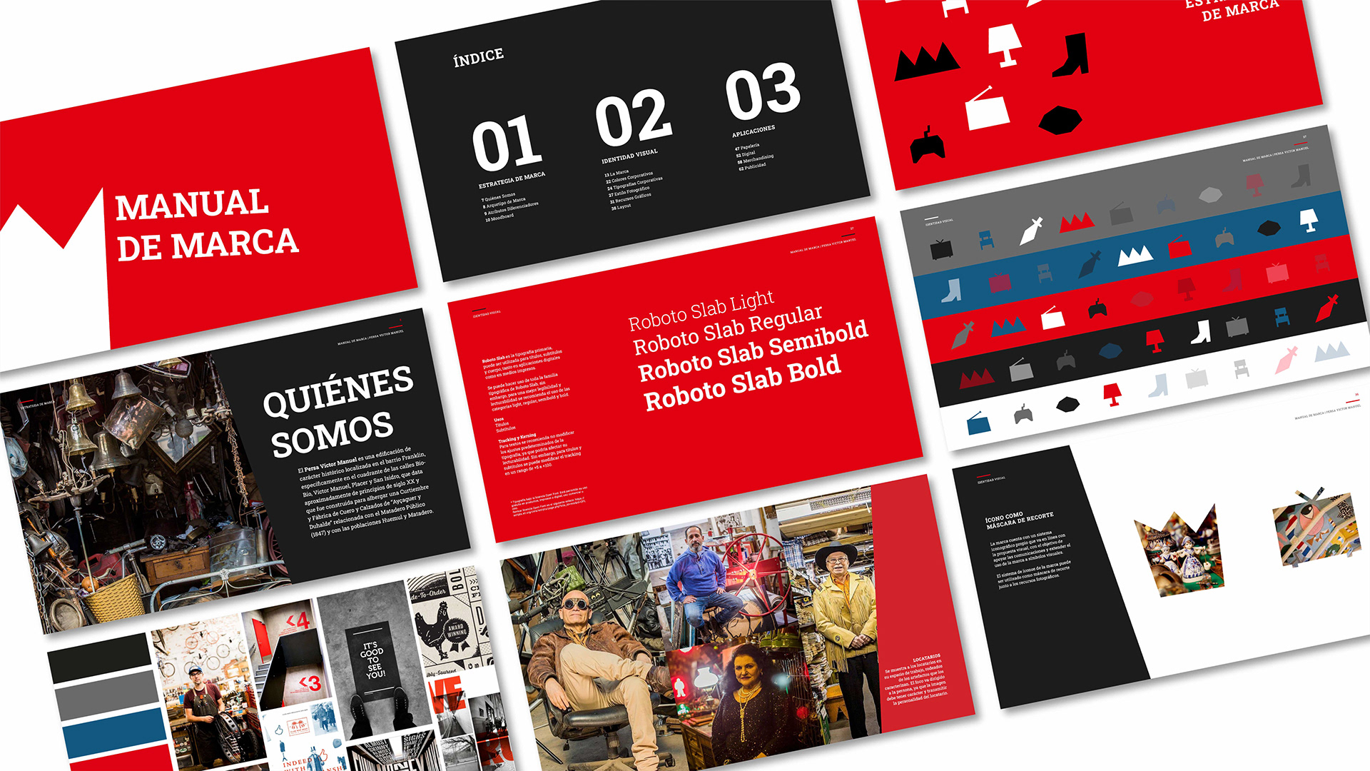
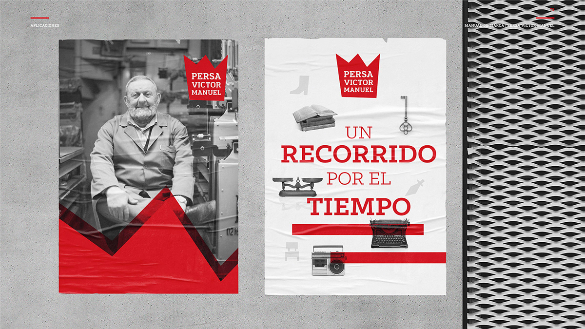
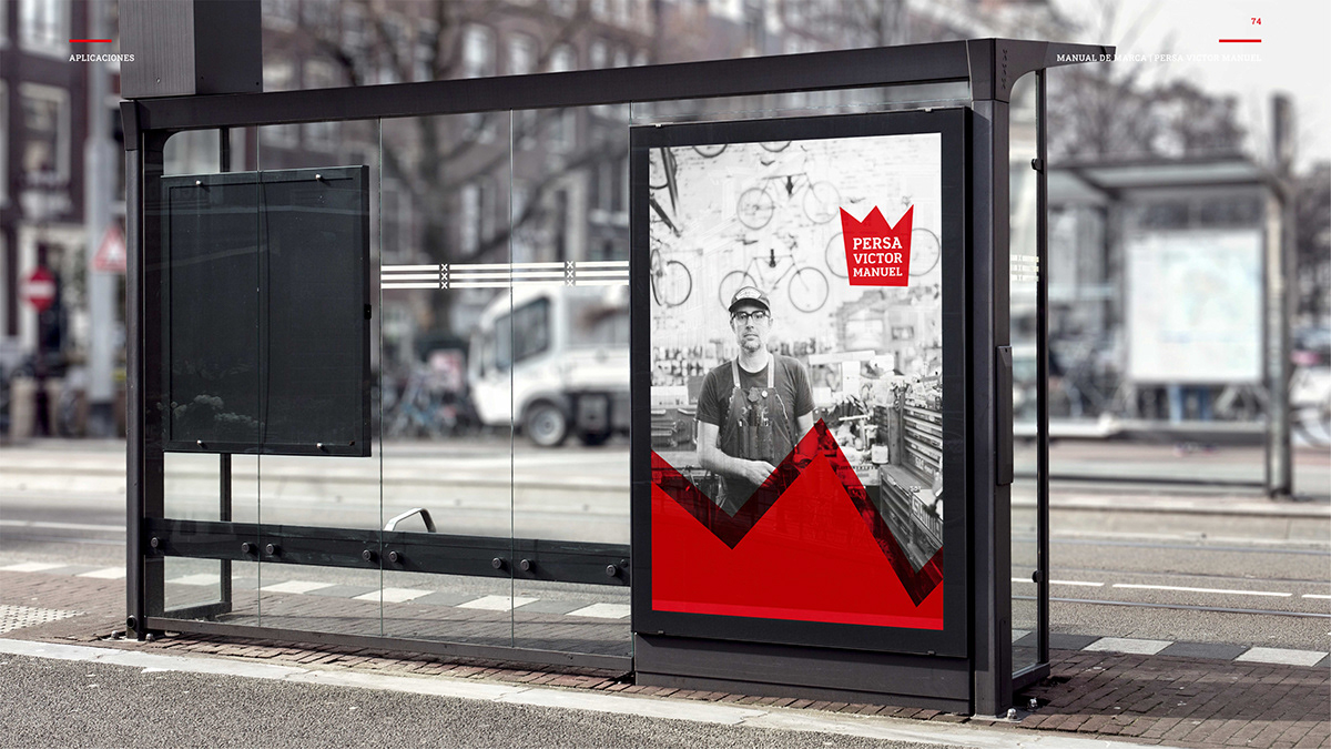
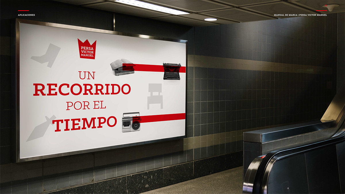
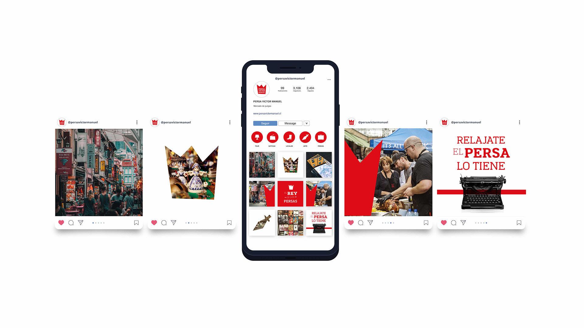
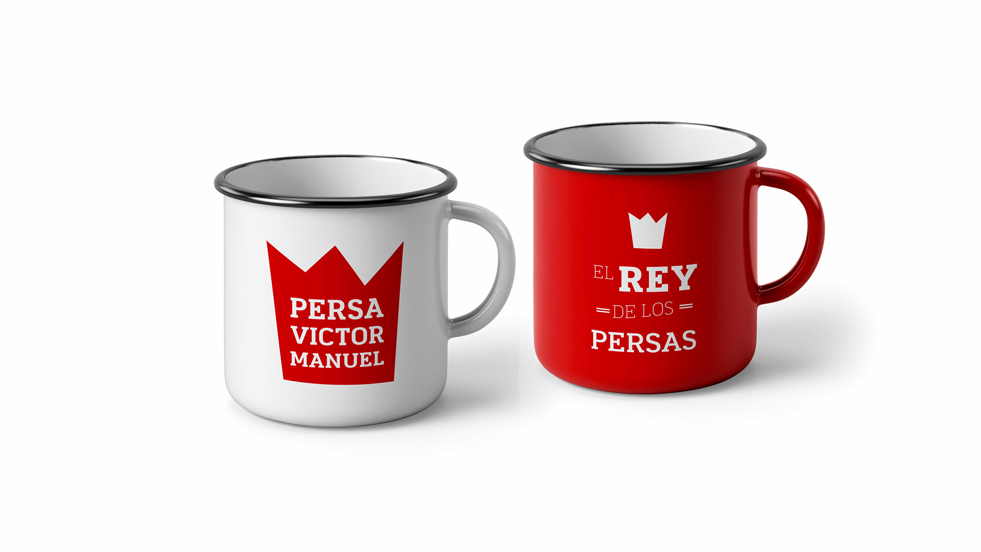
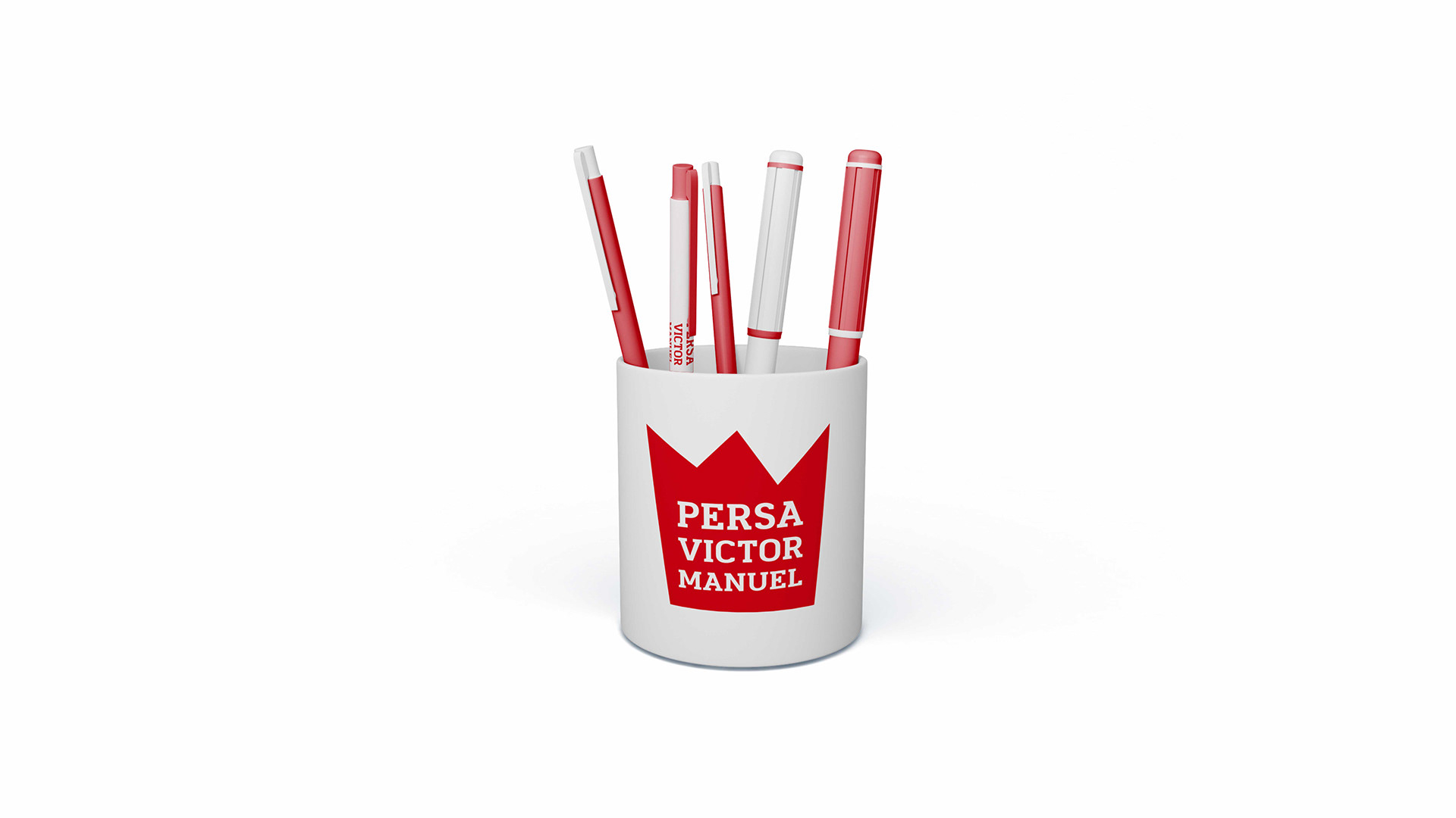
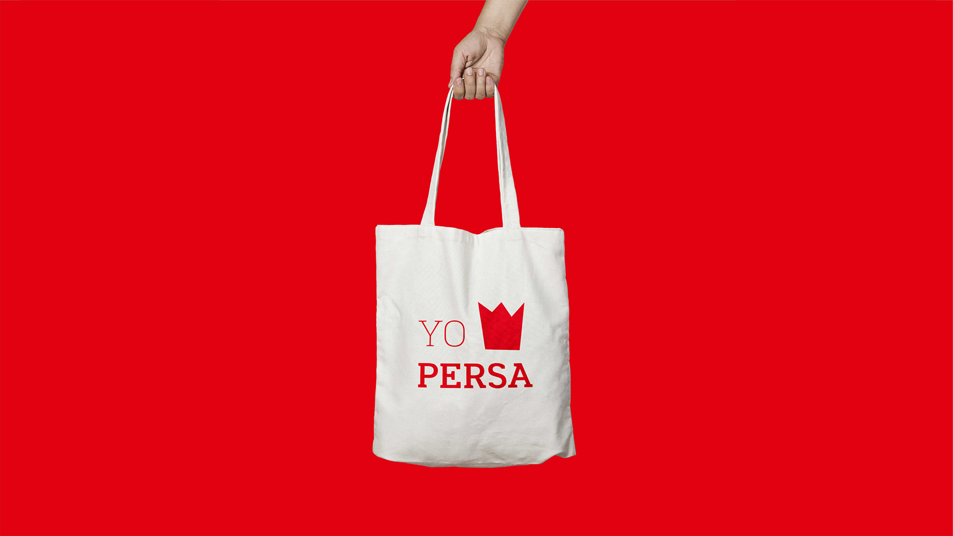
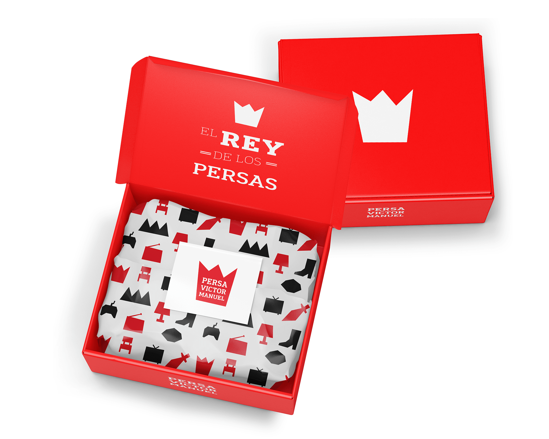
Persa Víctor Manuel is a historic flea market located in Santiago's Franklin neighbourhood — at the corner of Víctor Manuel, Placer and San Isidro streets. Built in the early 20th century, it's one of the most iconic cultural landmarks of Santiago, home to hundreds of vendors, artisans and collectors.

We were invited to redesign its brand identity and signage system, creating branded applications that respected the market's historical and community-driven spirit — while giving it the visibility and dignity it deserves as part of the city's living heritage.

El Persa Víctor Manuel es un persa histórico ubicado en el barrio Franklin de Santiago — en la esquina de Víctor Manuel con Placer y San Isidro. Construido a principios del siglo XX, es uno de los landmarks culturales más icónicos de Santiago, hogar de cientos de locatarios, artesanos y coleccionistas.

Nos invitaron a rediseñar su identidad de marca y sistema de señalética, creando aplicaciones que respetaran el espíritu histórico y comunitario del persa — dándole la visibilidad y dignidad que merece como parte del patrimonio vivo de la ciudad.

The concept
El concepto

El Rey de los Persas

The Idea
La idea

A crown, for the king of the market.

Una corona, para el rey del persa.

In Chile, the word "persa" (flea market) has historically carried stigma — often associated with the informal and the overlooked. The concept behind this rebrand flips that narrative completely: Persa Víctor Manuel is not just any persa — it is the king of them all.

The symbol is a bold, hand-cut crown that doubles as the silhouette of the "M" in Víctor Manuel. Red, loud and memorable — it works as a logo, a clipping mask for photography, a pattern unit and even a love-heart in "Yo ♥ Persa".

En Chile, la palabra "persa" ha cargado históricamente con un estigma — muchas veces asociado a lo informal y lo invisibilizado. El concepto detrás de este rebrand le da vuelta completamente a esa narrativa: el Persa Víctor Manuel no es cualquier persa — es el rey de todos.

El símbolo es una corona hand-cut contundente que también funciona como la silueta de la "M" de Víctor Manuel. Rojo, fuerte y memorable — funciona como logo, como máscara de recorte para fotografía, como unidad de patrón y hasta como el corazón en "Yo ♥ Persa".

Voice & Taglines
Voz y taglines
Yo ♥ Persa
Relax — the Persa's got it.
Relájate — el Persa lo tiene.
A journey through time.
Un recorrido por el tiempo.
Brand Guidelines
Manual de marca

A system built on character.

Un sistema construido desde el carácter.

The full brand manual documents the strategy, visual identity and applications. The typography — Roboto Slab — brings weight, history and a printed feel that connects with the market's roots. The icon system turns everyday objects from the persa (lamps, radios, typewriters, boots) into a distinctive visual vocabulary.

El manual completo documenta la estrategia, identidad visual y aplicaciones. La tipografía — Roboto Slab — aporta peso, historia y una textura de imprenta que conecta con las raíces del persa. El sistema iconográfico convierte los objetos cotidianos del mercado (lámparas, radios, máquinas de escribir, botas) en un vocabulario visual propio.

Persa Víctor Manuel — brand manual spreads

Brand manual — strategy, visual identity & applications

Manual de marca — estrategia, identidad visual y aplicaciones

The locatarios
Los locatarios

Putting the people on the poster.

Poniendo a las personas en el afiche.

The market's soul lives in its vendors. The poster campaign uses black & white portraits of the locatarios with the red crown as a clipping mask — treating them with the dignity usually reserved for fine-art photography.

El alma del persa vive en sus locatarios. La campaña gráfica usa retratos en blanco y negro con la corona roja como máscara de recorte — tratándolos con la dignidad habitualmente reservada a la fotografía de autor.

Poster — Un recorrido por el tiempo

Poster campaign — "A journey through time"

Campaña gráfica — "Un recorrido por el tiempo"

City applications — paraderos, metro stations, public spaces

Aplicaciones urbanas — paraderos, metro, espacios públicos

Digital
Digital

A voice that belongs to the barrio.

Una voz que le pertenece al barrio.

The social media system uses the crown as a recurring frame, the icon language for grid rhythm, and a tone of voice that speaks Santiago — warm, cheeky, proud of its roots.

El sistema para redes sociales usa la corona como marco recurrente, el lenguaje iconográfico para darle ritmo al grid, y un tono de voz que habla santiaguino — cálido, pícaro, orgulloso de sus raíces.

Social media — Instagram
Merchandise
Merchandising

Mugs, caps, totes — wearable pride.

Tazas, gorras, tote bags — orgullo vestible.

The merchandise line was designed to turn visitors into ambassadors — enamel mugs that feel like they came out of a vintage kitchen, caps, totes, and even a pandemic-era mask with the icon pattern.

La línea de merchandising se pensó para convertir a los visitantes en embajadores — tazas enlozadas que parecen salidas de una cocina vintage, gorras, totes, y hasta una mascarilla de pandemia con el patrón iconográfico.

Final Thought
Reflexión final

Design as an act of respect.

El diseño como un acto de respeto.

Branding a cultural landmark is never about inventing — it's about listening. This work is a love letter to a neighbourhood, a market and the people who keep its history alive. The crown isn't just a logo: it's a quiet recognition that this place — and everyone inside it — already was, and still is, royalty.

Hacer branding para un landmark cultural nunca se trata de inventar — se trata de escuchar. Este trabajo es una carta de amor a un barrio, a un persa y a las personas que mantienen viva su historia. La corona no es solo un logo: es un reconocimiento silencioso de que este lugar — y cada persona que lo habita — ya era, y sigue siendo, realeza.

Let's build something meaningful together.

Construyamos algo con sentido juntas/os.

Get in touch Hablemos