VAL. All projects Todos los proyectos
Fivana — Brand identity
Fivana · Fintech

A visual identity for the future of financing.

Una identidad visual para el financiamiento del futuro.

Role / Services
Rol / Servicios
Brand Designer Brand Designer Visual Identity Identidad visual Brand Guidelines Guidelines Print & Digital Print + Digital
Studio · Year
Estudio · Año
BlancaEstudio · 2021
Project Overview
Resumen del proyecto

A fintech that wanted to feel alive.

Una fintech que quería sentirse viva.

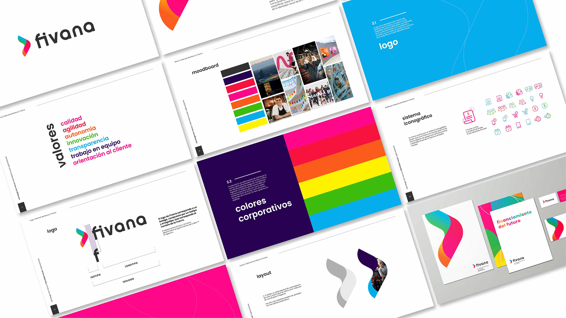
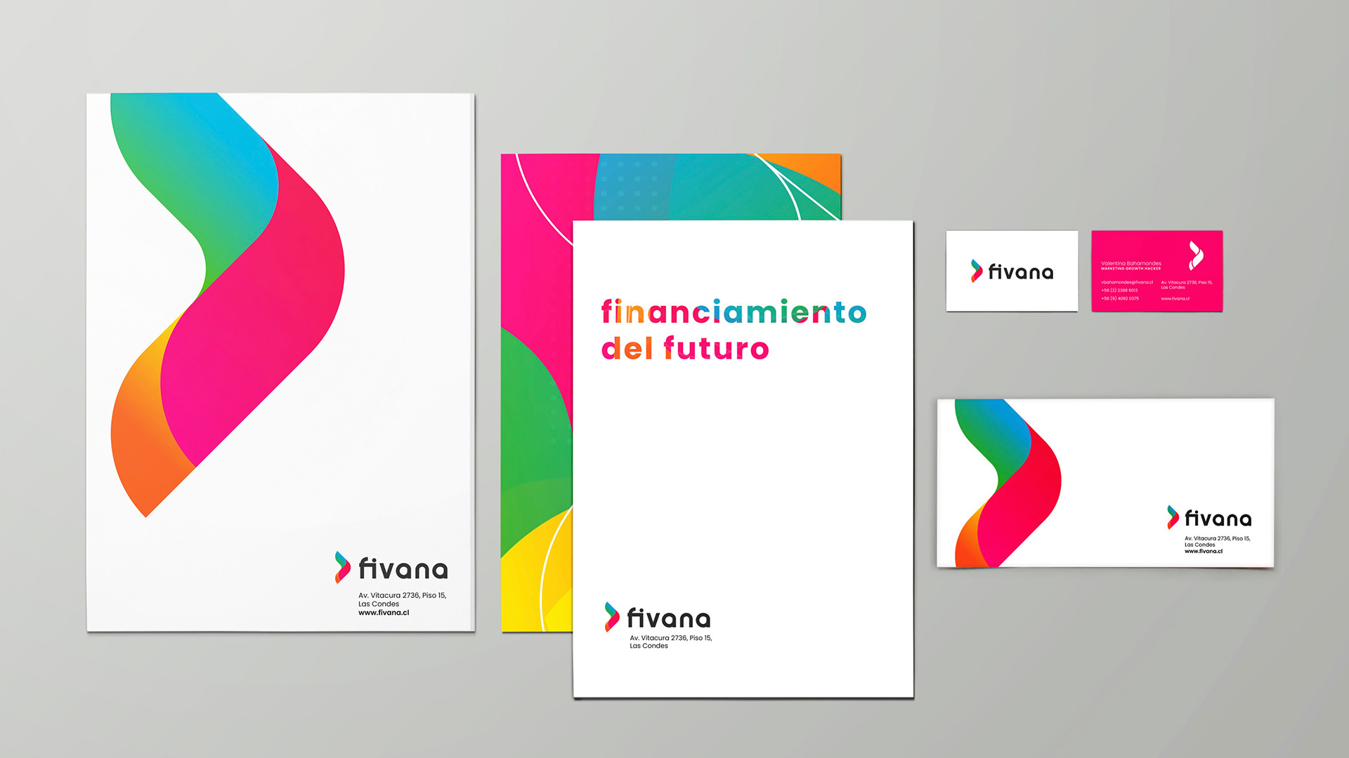
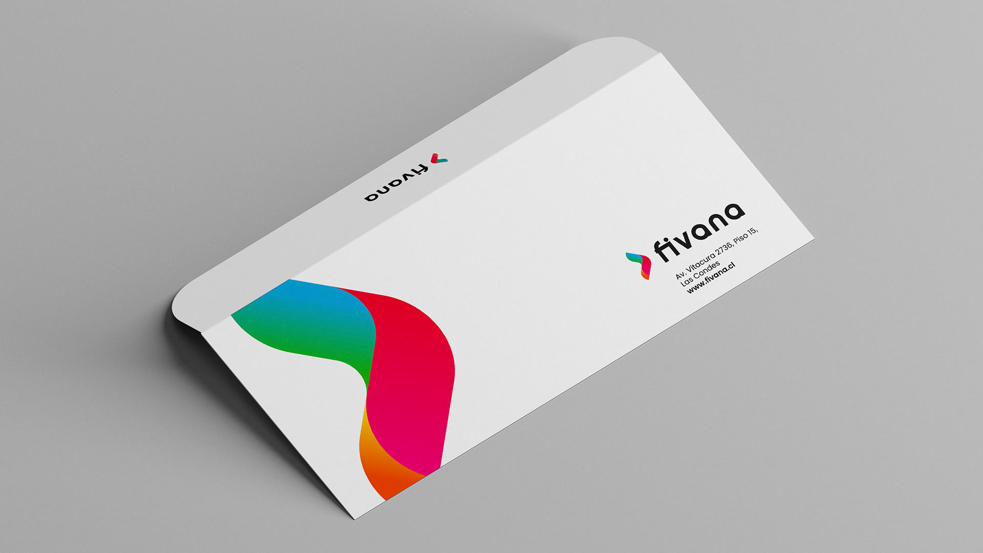
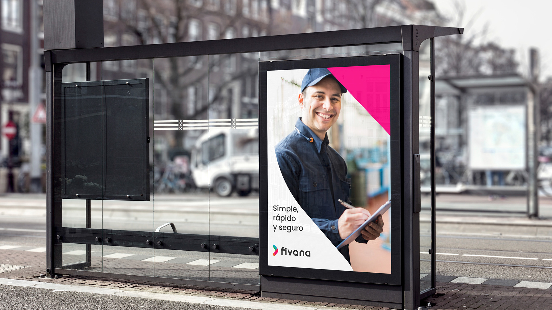
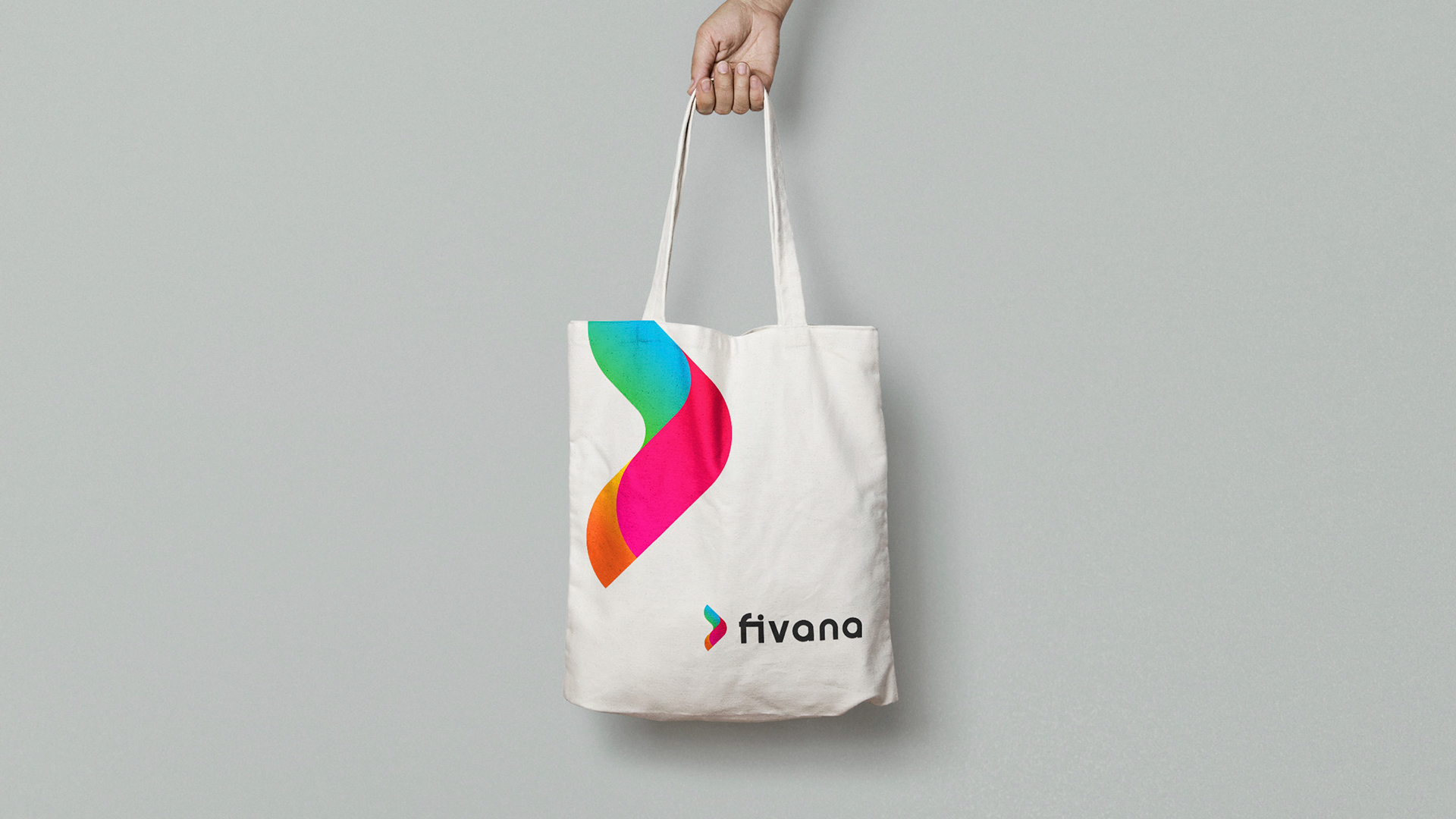
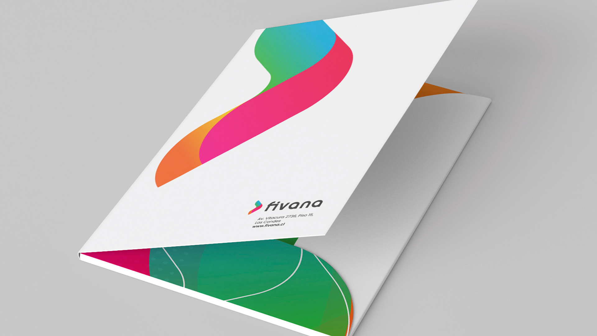
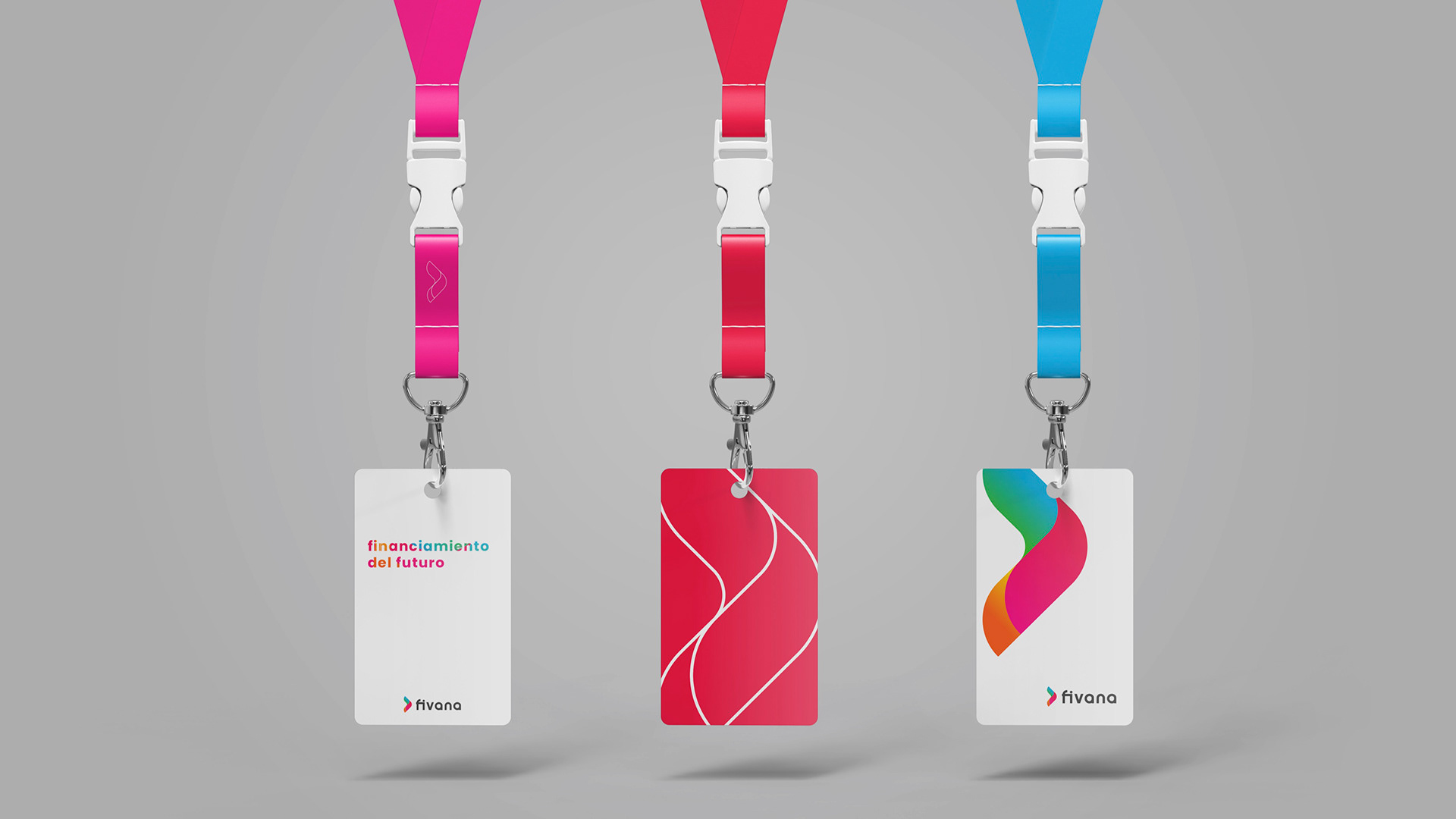
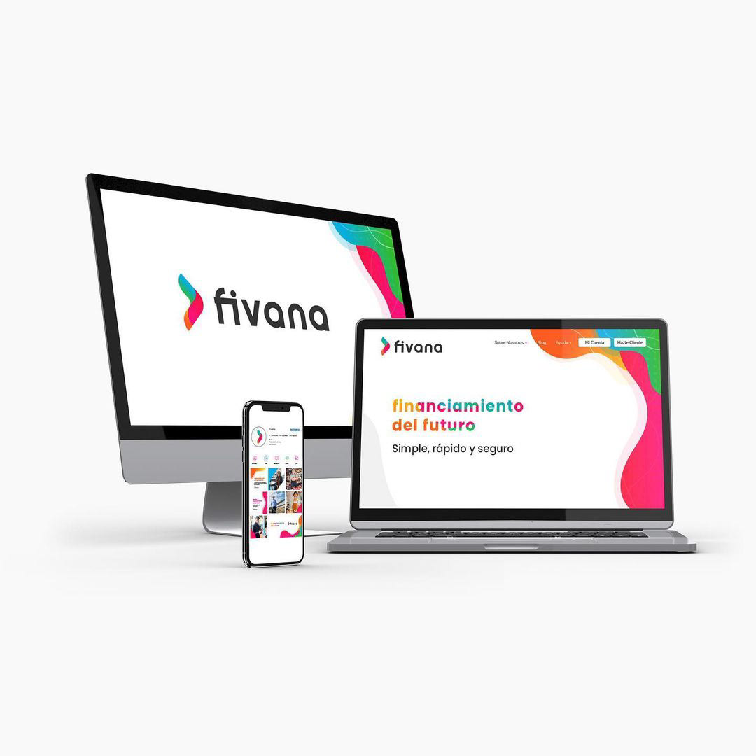
Fivana is a Chilean fintech company operating in a highly competitive space — where most brands look serious, distant and corporate. The brief asked for the opposite: an identity that signalled trust and growth, but also felt approachable, energetic and optimistic.

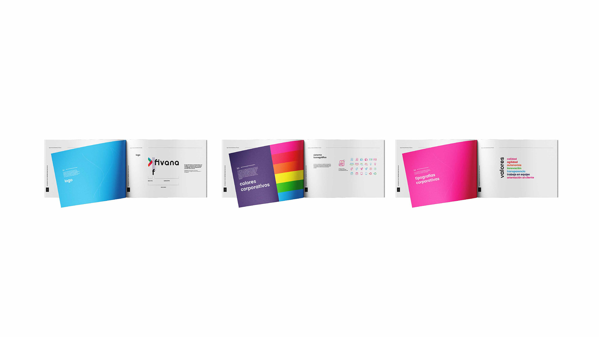
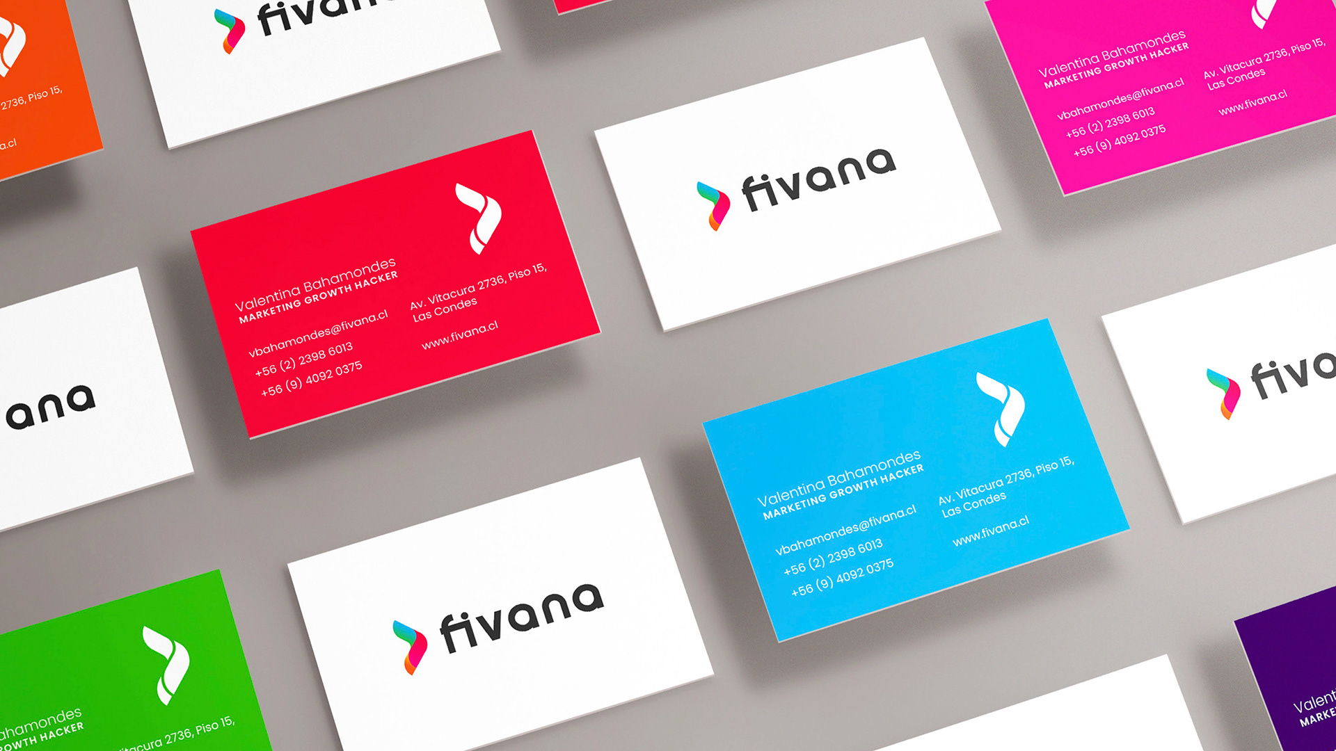
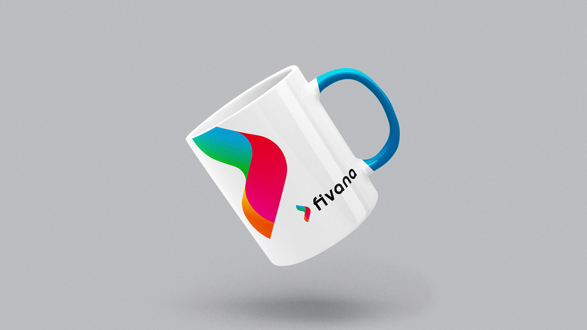
I designed the full visual identity and branding system, including UI-aligned assets and applications across every digital and print touchpoint.

Fivana es una empresa fintech chilena que opera en un rubro altamente competitivo — donde la mayoría de las marcas se ven serias, distantes y corporativas. El brief pedía lo opuesto: una identidad que comunicara confianza y crecimiento, pero que también se sintiera cercana, enérgica y optimista.

Diseñé la identidad visual y el sistema de marca completo, incluyendo assets alineados con la UI y aplicaciones en cada punto de contacto digital y print.

financiamiento
del futuro

Simple, fast, safe.

Simple, rápido y seguro.

Fivana logo
The Logo
El logo

Movement, colour and trust.

Movimiento, color y confianza.

The symbol is a flowing, continuous wave that moves forward — suggesting progress, liquidity and momentum. Its multi-colour gradient signals the diversity of people and businesses Fivana supports, while the rounded, bold wordmark keeps the brand feeling human and approachable.

El símbolo es una onda fluida y continua que se mueve hacia adelante — sugiriendo progreso, liquidez y movimiento. Su degradado multicolor comunica la diversidad de personas y negocios que Fivana acompaña, mientras que el lettering rotundo y redondeado mantiene la marca cercana y humana.

Brand Values
Valores de marca

Seven values, one system.

Siete valores, un sistema.

Every colour in the palette carries a meaning — each one tied to a value that defines how Fivana shows up in the world.

Cada color de la paleta tiene un significado — cada uno vinculado a un valor que define cómo Fivana se presenta al mundo.

Quality
Calidad
Agility
Agilidad
Autonomy
Autonomía
Innovation
Innovación
Transparency
Transparencia
Teamwork
Trabajo en equipo
Customer focus
Orientación al cliente
Brand Guidelines
Manual de marca

A full brandbook, ready to scale.

Un brandbook completo, listo para escalar.

The full guidelines document every piece of the system — logo, isotipo breakdown, corporate colours, icon system, typography, moodboard, layout rules and brand applications.

El manual completo documenta cada pieza del sistema — logo, isologo, colores corporativos, sistema iconográfico, tipografía, moodboard, reglas de layout y aplicaciones de marca.

Fivana brandbook — full spread

Brand guidelines — spreads from the full brand manual

Manual de marca — dobles páginas del brandbook completo

Fivana brandbook — key spreads
Applications
Aplicaciones

Print and digital, same voice.

Print y digital, una sola voz.

The system was tested across every possible touchpoint — from business cards and stationery to outdoor advertising, merchandise and digital interfaces — ensuring the brand felt consistent whether printed, carried or tapped.

El sistema se probó en cada punto de contacto posible — desde tarjetas de presentación y papelería hasta publicidad outdoor, merchandising e interfaces digitales — asegurando que la marca se sintiera consistente ya sea impresa, portada o toqueada.

Digital touchpoints
Puntos de contacto digitales

UI-aligned, from day one.

Alineada con la UI desde el día uno.

The brand system was designed with the product interface in mind — so the identity and the UI share the same palette, rhythm and voice.

El sistema de marca se diseñó pensando en la interfaz del producto — así la identidad y la UI comparten la misma paleta, ritmo y voz.

Fivana digital touchpoints — web, app, desktop

Web, app and desktop — one consistent brand

Web, app y desktop — una marca consistente

Final Thought
Reflexión final

Fintech doesn't have to feel cold.

La fintech no tiene que sentirse fría.

In a category dominated by corporate blues and rigid typography, Fivana chose colour, energy and warmth. The result is a brand that stands out precisely because it doesn't look — or sound — like any of the others.

En una categoría dominada por azules corporativos y tipografías rígidas, Fivana eligió color, energía y cercanía. El resultado es una marca que destaca precisamente porque no se ve — ni suena — como las demás.

Let's build something meaningful together.

Construyamos algo con sentido juntas/os.

Get in touch Hablemos